PRODUCT DESIGN CASE STUDY
Cari – Redefining Food Delivery in the Middle East
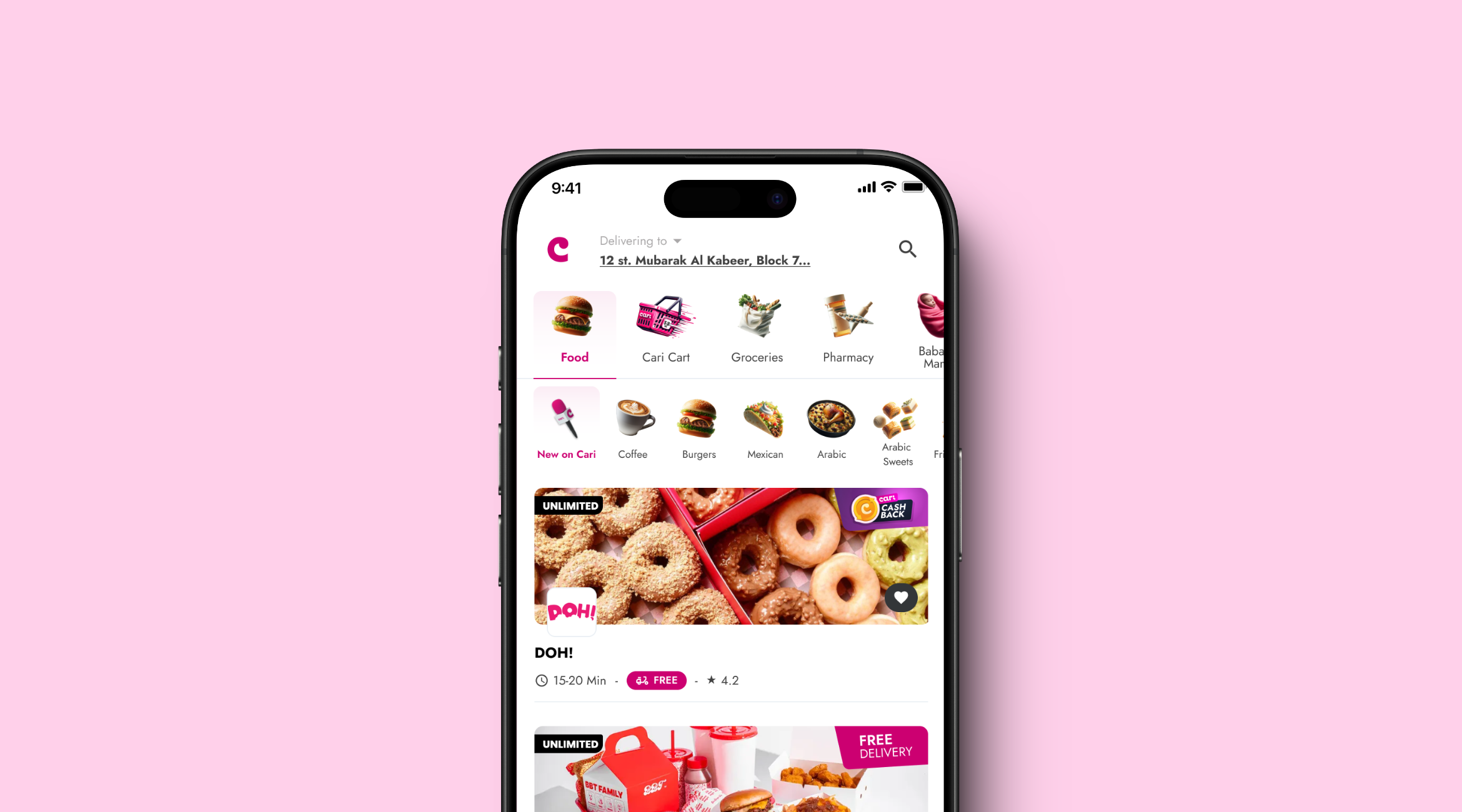
Cari is a leading food delivery app in Kuwait, Saudi Arabia, and now the UAE. It stands out by offering a zero commission model for restaurants, allowing them to keep more profits, and guarantees 30-minute free delivery with dine-in menu pricing for customers. These features make it a strong competitor against traditional platforms. Cari's partnerships with prominent brands like Tim Hortons, Baskin Robbins, and McDonald’s further enhance its reputation, driving rapid growth and customer satisfaction in the region.

My Role
As the Lead Product Designer, I was deeply involved in every phase of Cari's development. My priority was to create an app that felt effortless to use, not just for our customers but also for restaurant owners managing their operations. I spent a significant amount of time talking to both groups, understanding their pain points, and ensuring that our design would address their needs. From designing user flows to testing functionality across iOS and Android, I focused on making the app intuitive and reliable.
Team Structure
– 1 Product Manager
– 1 QA Tester
– 2 Mobile Developers
– 2 Backend Developer
– 2 Product Designers (including myself as the lead designer)
Year
2022 - Ongoing
Solving a Real Problem
Traditional food delivery platforms typically charge high commissions, cutting into restaurant profitability and leading to increased costs for customers. This makes it harder for restaurants to maintain competitive prices while still paying delivery platform fees. Additionally, many platforms offer limited control over menu management, promotions, and customer engagement, leaving restaurants with less flexibility.
As a result, restaurants often face challenges in managing their operations, expanding their customer base, and maintaining profitability on these platforms, which depend on high commissions for revenue.
Challenges
- Saturated Market: In a crowded space with well-established competitors, my challenge as Lead Product Designer was to create a visually distinct and highly intuitive platform that could stand out. This required innovative user experience design to capture attention quickly while offering seamless functionality to build user loyalty.
- Vendor Profitability: Designing for a zero-commission model was unique because we had to ensure that vendors felt empowered. My role involved creating an intuitive dashboard that allowed vendors to manage their menus, promotions, and customer engagement effectively, ensuring they maintained profitability despite the no-commission structure. It was crucial to simplify complex business operations into an easily navigable UI.
- Localization: Catering to the specific cultural and language needs of the Middle Eastern market posed significant challenges. This included adapting UX/UI elements to align with local preferences, incorporating right-to-left text flow for Arabic users, and ensuring the visual identity resonated with the region. As Lead Product Designer, I had to ensure the platform felt native to users while maintaining global usability standards.
Visual Design & Mockups
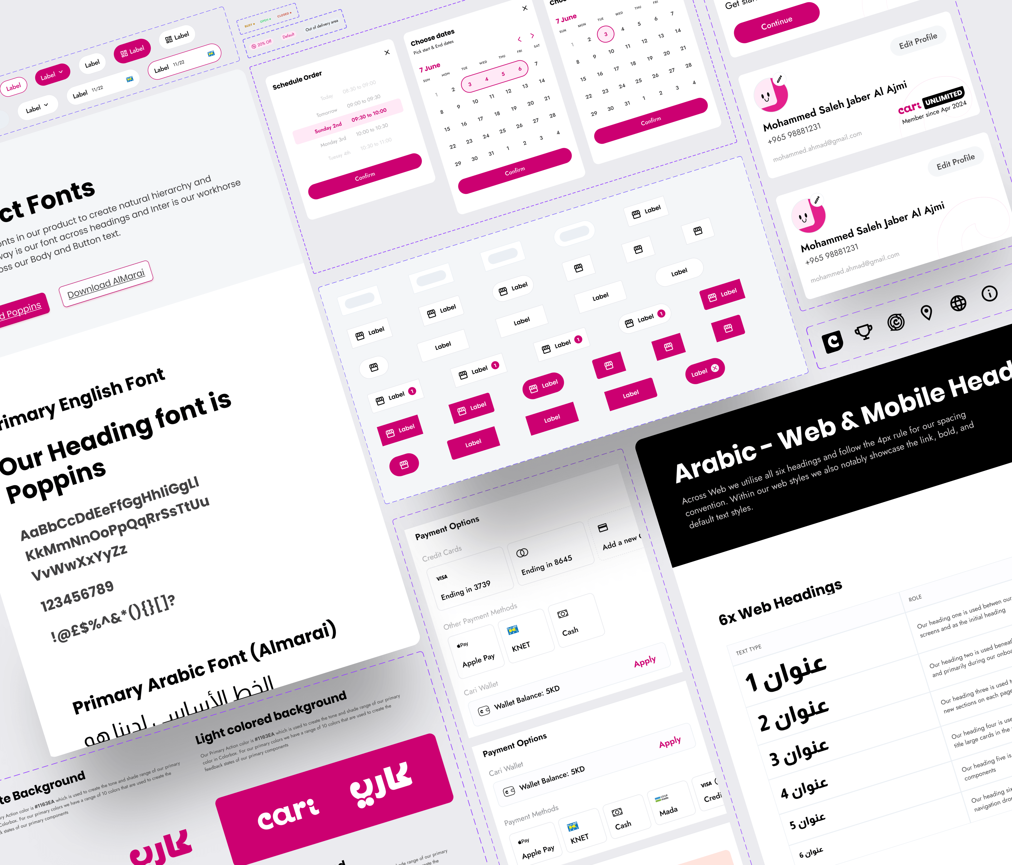
Design System Implementation: To ensure scalability and consistency as the app expanded, we implemented a robust design system that streamlined the development process. This system allowed us to maintain a cohesive visual identity across different platforms and regions while ensuring design flexibility for future iterations. The design system included reusable components, standardized typography, color schemes, and AI-generated icons, all of which contributed to efficient development and a seamless user experience.

AI-Generated Icons for Seamless Navigation: We leveraged AI-generated icons to visually represent various categories and sub-categories within the app. This not only streamlined the design process by automating the generation of consistent, high-quality icons but also enhanced the user experience by making it easier for users to identify and explore food options at a glance. These icons contributed to a cohesive, user-friendly interface that aligned with Cari’s scalable design strategy.
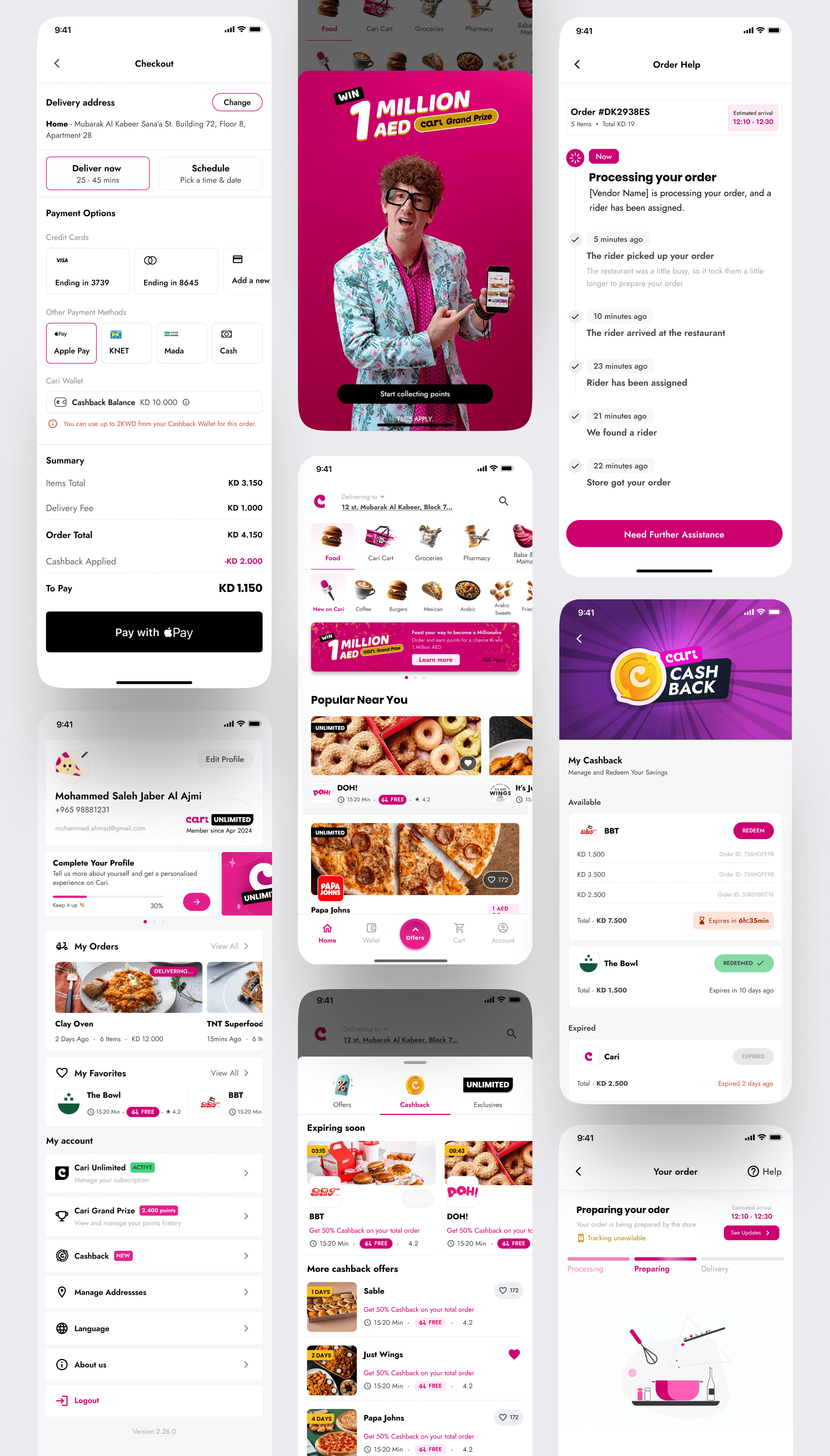
After multiple iterations and thorough design exploration, we arrived at these final mockups that balance functionality and aesthetics. The screens showcase essential aspects of the Cari app, including:
- Cashback integration and promotions, ensuring users can easily track and redeem rewards.
- Streamlined checkout flow, offering various payment options.
- Real-time order tracking, providing transparency and timely updates for users.
- Profile management and loyalty program, encouraging user engagement and retention.
.

Conclusion
Cari is quickly becoming a leading food delivery platform in the Middle East, thanks to its innovative zero-commission model for vendors, fast 30-minute free delivery, and dine-in menu pricing that resonate with customers seeking convenience and value. The app's visually engaging design highlights deals and offers, while its intuitive navigation ensures a seamless user experience.
Constant iterations and updates are made based on feedback from customers, users, and stakeholders, ensuring the platform remains responsive to evolving market needs and business goals. With its focus on customer satisfaction and vendor empowerment, Cari is poised for continued growth in key markets like Kuwait, Saudi Arabia, and the UAE.
Cari in the
Spotlight
Available now on App Store & Google Play
Over 100K+ app downloads
Cari expands food delivery app into UAE market
Zero commission food delivery app Cari lands in the UAE market
